
type visions |
Project Type
Brand Identity
Software
Adobe Photoshop, Adobe InDesign, & Adobe Illustrator
Role
Creative Director
What started off as a creative itch, became a full-on personal project to explore and challenge myself creatively with the world of what-ifs. After taking a break to focus on completing my degree in Communications, my creative spirit remains and with this project I hope to show the progress I've made in terms of branding, product design, and composition.


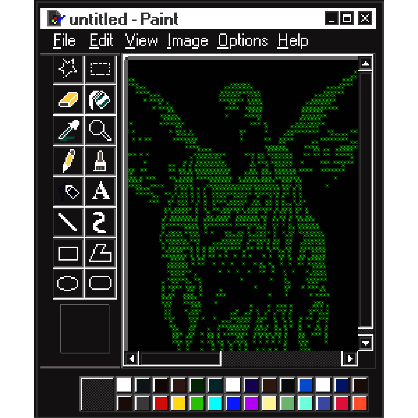
Type visions, stylized as type visions | , is a brand concept I am developing to showcase my Adobe Creative Suite skills largely focused on composition and consistency. Named Collective, Chrome Hearts, & ASCII art are my main influences. The goal of this project was to emphasize visual design and elevate merchandise.
Challenge and Objective


make a wish?
"wishbone"
primary logo
"sick of all
the wishin' in
my mind"
Inspired by C-pop group, WayV, the logo draws from the first few lyrics of their debut serving as an origin for the brand's spirit and creativity.
The logo evolved into a wishbone to reflect both the lyrics and the meaning of visions. The breaking of a wishbone is a custom originating from Ancient Europe consisting of two individuals holding the each end of the bone breaking it in half to make a wish.
Serving as the primary logo the wishbone is emblematic of the brand's statement of bringing visions to life.


"type visions archive"
Brand Implementation


click?


Step into the dreamworld of type visions, for an immersive art experience with pop-up exclusive merchandise and photo opportunities. This brand implementation features a life-sized keychain holder offering guests to imagine themselves as a bit-sized K-pop idol on their bag. To the left and right of the installation, guests can shop from a selection of merchandise.
Experiential Retail
"Jacquard 12"
primary typeface and wordmark
Despite its pixelated look Jacquard 12 was a typeface developed for knitting, originating from a Victorian needlepoint alphabet circa 1880. It serves as the wordmark and primary typeface for a strong personality that blackletter typefaces are sought out for. Playing into the branding of type visions, it bridges traditional and modern visuals to form something new. Accompanying Jacquard 12 is Menlo as the secondary and tertiary typeface, a monospaced sans-serif emulating a terminal.
Overall, early web design and magazine layouts influence the brand's composition. Drawing from Chrome Hearts' Japanese design philosophy, the layout is maximalist with an emphasis on unity creating a natural flow from left to right.


Color and Visual Direction
The brand's palette is clean, sticking to three colors for a cohesive and consistent look that brings endless possibilities for the art to take center stage.
#14FF00
#00000
#FFFFF
